0
pause
Monday, October 31, 2016
Tuesday, October 25, 2016
Sigh

We begin with a pattern that didn't double in a day, but it did nearly double in a month, back in February. Are there any clues here - we can only see a fragment of action prior to that rally ... Was there anything in the chart in February to tell us to buy? It's hindsight, of course, so of course there is, you could say. Well, at any rate at the very beginning of the chart there's a heel - the third bar in. A few days later it's a double heel. There were other interesting candles over the next two or three weeks, but, to simplify things, after the priced dipped below that first heel, well, first, they immediately jumped. You get some kind of bottom - the heel - and then after a while the price dips just below that bottom, and it makes a bottom there, and today I noticed quite a few that did that combination of things and then rallied. The second bottom, the one that just dipped lower, turn out to be a lasting bottom. So here, hypothetically, once that happened, with the big bounce following instantaneously, you could be buying at any reasonable price, and if it dips below the second bottom again, you have to sell. In this case the risk, applying that tactic, was about 20%, so, pretty significant. It's another obvious truth that isn't necessarily significant, but it's would arguably be possible to analyze things more closely and buy with a closer stop. In fact the example is illustrative, but I'll discuss that elsewhere. For now, if, just supposing, we had an idea of where this was headed, then the risk - reward ratio in this trade would have been sort of decent - the potential 20% loss vs the potential near 100% gain. But what could possibly have predicted exactly a double, here? Maybe something in the weekly chart?

It could be said there usually is something. There in the middle of the big collapse at the end of 2015 is a small hesitation, in December, around the $8 price.
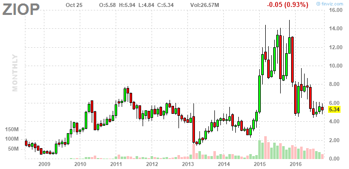
The idea entered my mind to look at the monthly chart, to, just for the sake of thoroughness, and I'm kind of glad I did. It's just an interesting chart. Well, first off, there's the big trough, between the big 2011 top and the big 2015 top, and it certainly did jump out of that, making, incidentally, a higher bottom, a big broad one, centered around 2013, if you see what I'm saying, and then, and this is a little weird, as soon as, after the big top in 2015, it got back down in the vicinity of the tops in the trough, it started to bounce around up and down. Go figure. What do the tops in the trough have to do with the larger waves? But, I see this kind of thing all the time. Can't pass up noting that the most recent bottom, which looks like it occurred August, maybe, just dipped below the earlier bottom from January and February. Hmm, on the weekly chart it appears to not have dipped lower, but on this monthly chart it appears to have done so. No, maybe I see it on the weekly now, and on the daily chart, too. It's kind of microscopic. Anyway, the question I'm asking is, is this a buy signal? Well the July bottom - turns out it was in July - now hold, and will prices now move up steadily, even dramatically, from where they are today? This monthly chart distinctly predicts, from, you could say, a purely visual perspective, prices above the top of the chart, even far above the top of the chart, at some time in the future. It would be reckless of me to suggest even the top of the chart will likely be reached in any very short period of time, and caution, even just sense suggests it ought to take some years, even to reach $16 again, but I feel compelled to at least point out the possibility of a rather sharp increase rather soon, perhaps taking prices to near 16 somewhere, but not lastingly so. Maybe this is what I'm hoping for. But let's look at another thing, particularly because I see evidence of long term strength in this chart. For what it's worth, the fundamentals may confirm or deny that interpretation, but let's see. Consistent but very modest revenues, quarterly, the past 5 quarters, and consistently substantial losses, with the most recent being rather a whopper (and the others not quite that extreme). Consistently rather abundant current assets, and ... consistently rather substantial total liabilities ... and consistently very moderate current liabilities. This over five quarters. The pattern kind of holds up over the last four years. Revenues do seem to be growing, and then on the balance sheet in past years they've had no debt, this last quarter they added a bunch.
Sigh.
Subscribe to:
Posts (Atom)